The request always arrives in the same shape. A campaign section carrying a partner brand’s identity, in the middle of a page that already has its own theme. Or a warm editorial block inside a product that is grey and blue. The piece looks different from the rest of the page, but on the inside it is the same buttons, the same fields and the same cards.
The usual answer from the design system is a parallel stylesheet. Classes along
the lines of --on-dark appear, plus a button variant for dark backgrounds,
another one for form fields, and a context rule for every component that might
end up inside the block. In practice that means maintaining two versions of every
component, reviewing every change twice, and finding out in the third quarter
that the campaign variant never got the focus state that was fixed in the main
one.
The alternative is to change where the theme lives. If the theme is a property of a container rather than of the page, the campaign block does not need different components: it needs to declare that a different colour contract applies inside it. I call that container a theme island.
An island is a subtree with its own colour contract
The definition is short: an element marks in the DOM which theme applies from there on, and everything hanging below it adopts that theme without knowing it sits inside an island. A button inside the campaign island paints itself with the campaign colours and its source code does not change by a single line. Neither does the card containing it, nor the form field next to it.
What makes the model useful is that it introduces no new mechanism. The global
theme of this site is exactly the same mechanism applied to the <html> element,
which in this repository goes by the island name page. The page is island
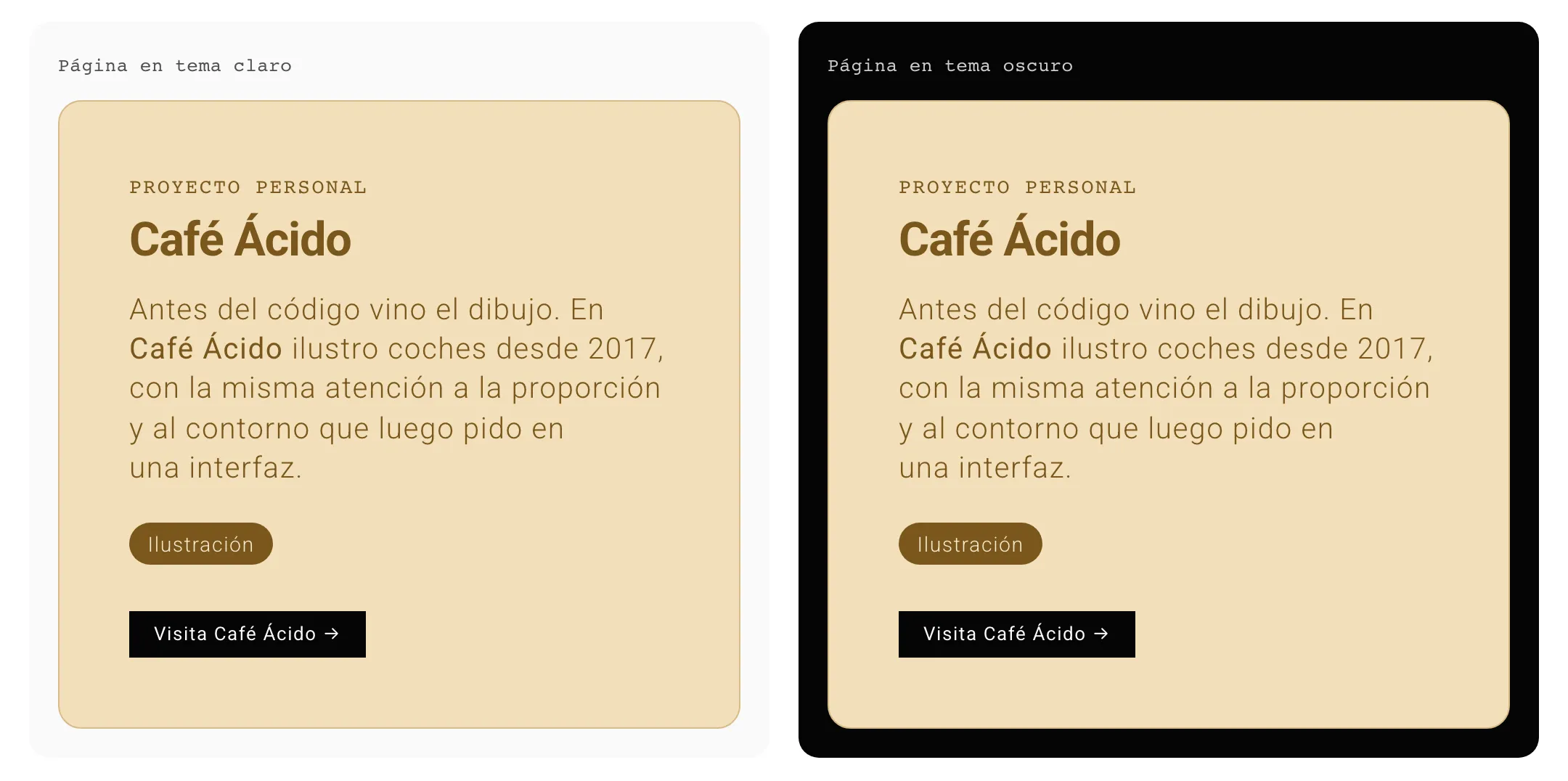
number zero. When the «Café Ácido» section of my profile page declares its
editorial theme, it is not using an exception to the system: it is doing what the
root does, one level further down. Islands nest, and each one only redefines what
it declares; the rest it inherits from the island above.
That uniformity has a practical consequence you notice while debugging. There is no code path for “the theme of the page” and another one for “the theme of this block”, so there are no two places where they can drift apart.
What stops costing money
What justifies the pattern to whoever pays for the hours is the maintenance line item that disappears.
It starts with context variants. A system with forty components that solves dark backgrounds by duplicating variants has eighty pieces to maintain, and every fix has to be applied twice or explicitly waived. With islands, the figure goes back to forty. That saving is invisible on the day the pattern ships; it shows up in every fix over the following two years, split into pieces too small to appear in any report.
It continues with who executes the request. Adding an island theme means writing a block of sixteen colour declarations and one line in the theme registry. No component file is opened, so the change cannot break anything outside the pages that use it. That moves the task: it stops being a modification of the design system, with its review and its queue, and becomes configuration.
Contrast, which is the part that usually degrades in campaign work, gets decided once. In each island theme, the background and the text of a surface are declared together, in the same block and in plain sight. Verification happens over those pairs when the theme is created, not over every screen where the block will appear. It is still mandatory work, but it is a bounded ten-minute task instead of an audit per campaign.
And white labelling turns out to be the same mechanism. A product sold with the client’s visual identity, or a widget embedded on a third party’s site, pose the same problem as the campaign: a subtree with a different colour contract. If the pattern is already in place for the promotional section, multi-brand support stops being a project and becomes one more token file.
A new theme in an afternoon
Of the whole setup, the part that changed how I work the most is the test loop. This site carries a theme panel that walks the DOM looking for islands and builds a selector for each one. From there you can change the theme of any block on the page live, the root included, and see straight away how the real content looks with its own text and images.
Below the list there are two more things. A JSON object with the theme each island currently has, which is the configuration of the view ready to copy, and a theme builder with one colour picker per each of the sixteen tokens. When you are done, the panel hands back the CSS block of the theme to paste into the island themes file.
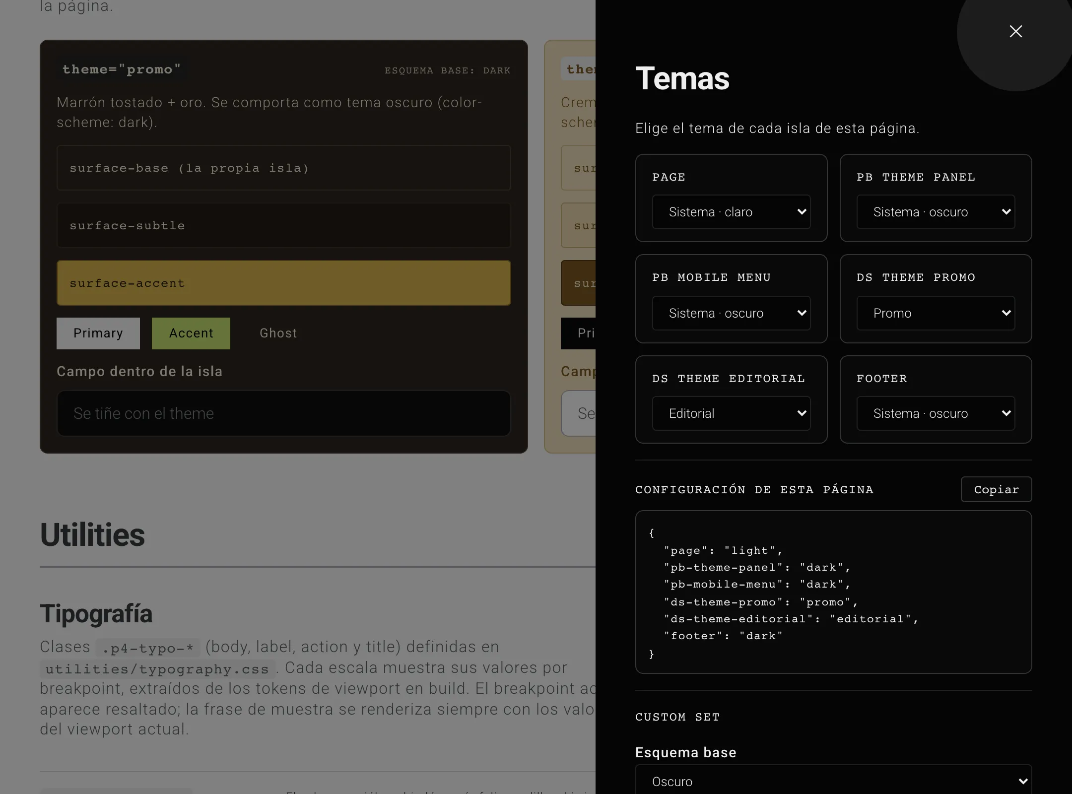
With that tool, trying out a campaign identity over real content no longer needs a branch, a preview deployment and a meeting. It happens on the page itself, the resulting block gets copied, and the engineering work is pasting it. What used to be argued over a static mockup gets decided on the page that will actually ship.
Underneath there is a small component and a token chain
The component that activates an island takes little more than fifty lines and its runtime work is none. It takes the theme, resolves two data attributes and writes them onto the element wrapping the content:
<ThemeIsland theme="editorial" name="cafe-acido" as="section">
  <!-- any content: it takes the theme on its own -->
</ThemeIsland>
Out of that comes a <section> with data-theme="light" and
data-island-theme="editorial". There is no client JavaScript, no framework
context and no state to synchronise: the whole component reduces to those two
attributes written into the HTML at render time.
The real work happens underneath, in the four-layer token architecture I described in «When a token system needs four layers». An island theme touches neither the primitive layer nor the semantic one: it reassigns role tokens only, which are the ones built to switch. Because components consume roles and never values, the reassignment reaches the last nested element without any of them being aware.
The concrete model is base scheme plus surfaces. The island theme declares
whether it starts from light or dark, and with that single declaration it
inherits color-scheme, the action family, the focus ring and the rest of the
system, all already verified. On top of that base, one rule overrides the
surfaces only: background, text, icon and border of the base, subtle and accent
variants, plus the modal dialog. Sixteen tokens, and that is where the whole
customisation surface of a theme ends.
How the cascade resolves, why the adoption rule uses inherit as its fallback
value and how the flash on load with a stored theme is avoided is enough material
for its own article, and I will write that one separately.
What it costs and where it stops being worth it
The decision that shapes the result the most is that one, limiting the island theme to surfaces. The alternative was letting each theme declare the full set of role tokens, actions and focus included, so a button inside the campaign island could carry the partner’s colour. I discarded it because it turns every new theme into a full accessibility review: hover and active states, contrast of the text over each button variant, and visibility of the focus ring over the new background. Multiplied by every campaign, no team sustains that.
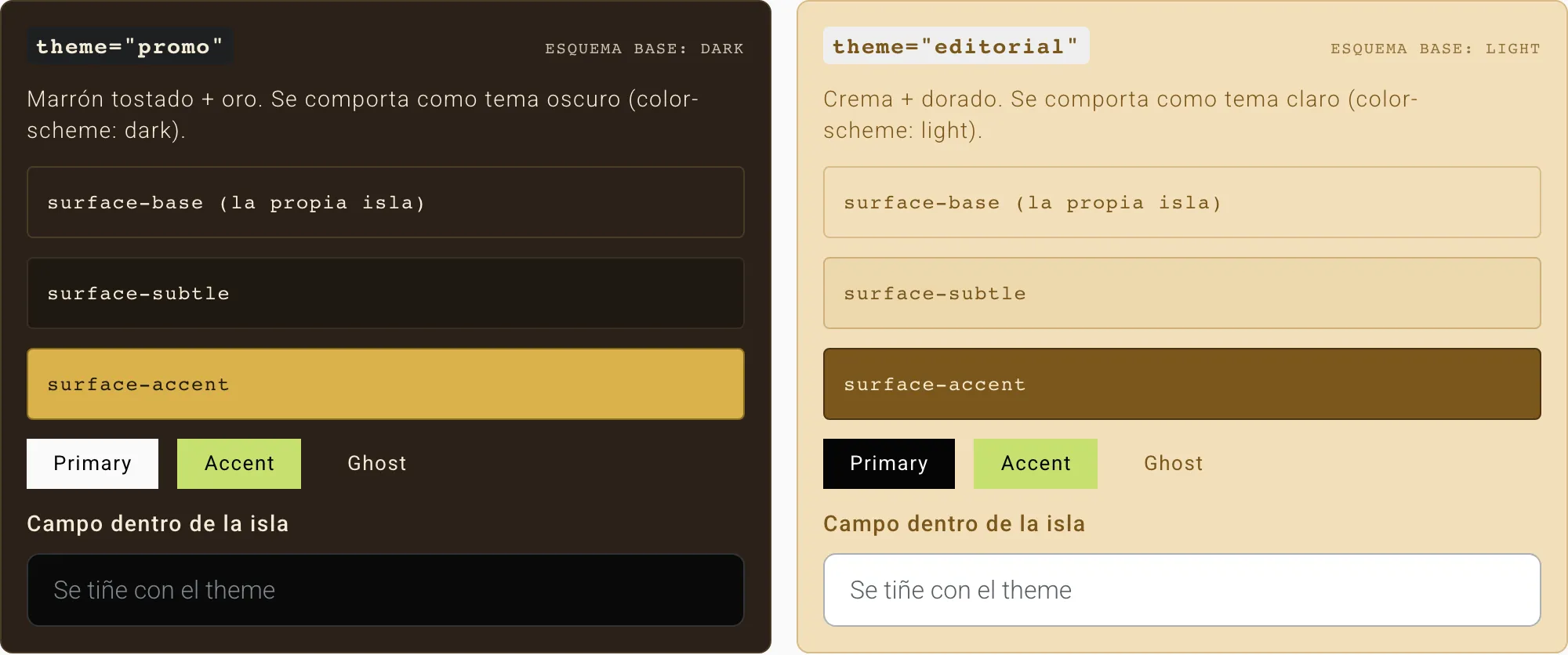
The price of having discarded it is concrete, and worth stating before whoever builds the first campaign discovers it: inside an island, buttons come out with the colours of the base scheme, not those of the theme. It is visible in the first screenshot: the accent button is lime in both islands, and the primary one only changes because the scheme changes, light on the brown and black on the cream. Neither of them takes the golden colour of the theme. When a campaign genuinely needs its own action colour, two exits remain and both are deliberate work: use the component layer in that specific view, or extend the island token registry and take on the verification of states after all.
The limit of validity is the usual one for this kind of architecture. A product with a single theme, no campaigns and no clients wanting their brand on top needs none of this; well-named semantic tokens and a rule banning hexadecimals in components will do. Islands start paying for themselves when the second block with its own identity appears, and they become the cheap option when that block has to coexist with both system themes.
The test I apply to decide fits in one question: if looking at the design forces you to ask “and this button, what colour is it here?”, the theme is no longer a property of the page.