There is a bug that shows up on no dashboard. It throws no exceptions and breaks no build. It triggers the day your product enters a market that does not write in the Latin alphabet, and what degrades is not an endpoint: it is the brand.
The mechanism is this. Almost every brand font (Roboto, Suisse Intl, any corporate grotesque) covers Latin and little else. When the browser’s font matching algorithm hits an Arabic, Chinese or Hebrew character with no glyph in the declared font, it walks down the stack, finds nothing, and lands on whichever system fallback it sees fit: a different typographic personality, a different optical size, a different x-height. Arabic renders tiny next to Latin. CJK falls back to whatever is there. Everything “works”. And the interface reads as careless in exactly the market where trust is hardest to earn.
The usual answers cost money and calendar time. This is the one I implemented in my own design system, and its balance sheet fits on one line: nine writing systems covered with zero kilobytes downloaded, zero new licences and no changes to any component.
The result, before the technique
The same welcome screen, with the Latin brand font untouched. On the left, what the browser delivers by default; on the right, what the design system delivers:
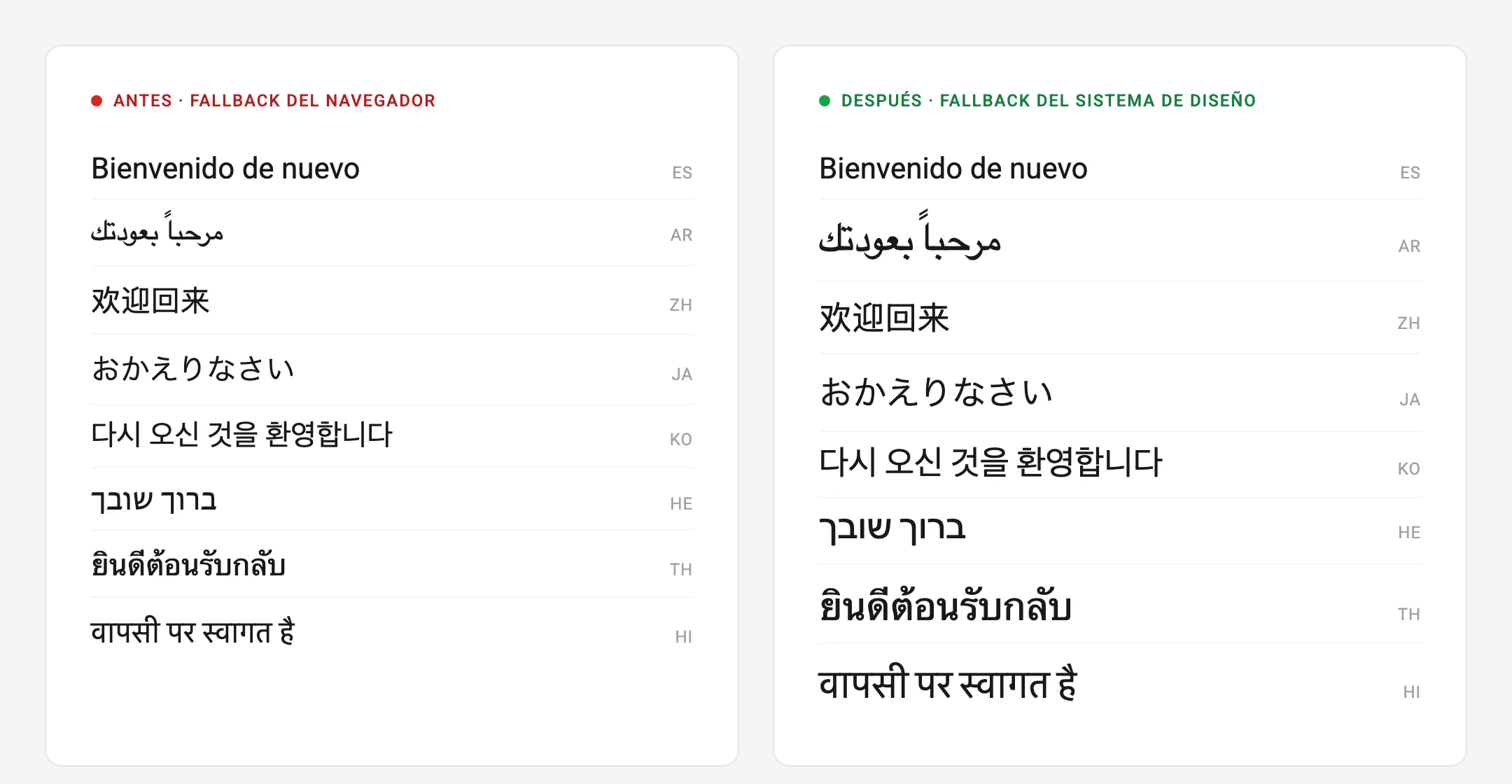
There is no error in the “before”: it is the standard behaviour of any site whose
brand font only covers Latin. Each script falls to a different fallback and
renders smaller than Latin at the same font-size, because every writing system
draws its glyphs at a different proportion of the em square. In the “after”,
each script uses its platform’s native grotesque, optically calibrated to match
the visual height of the Latin.
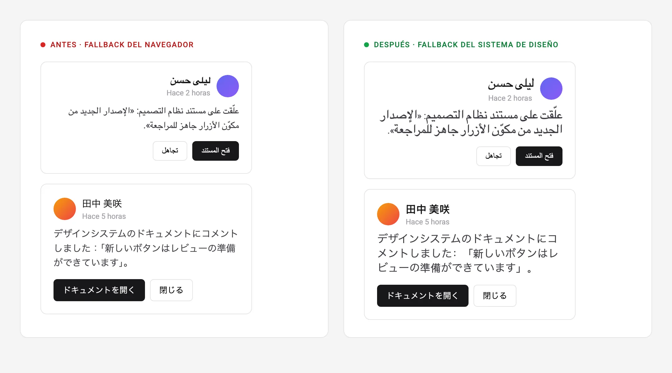
The effect is clearest where it actually hurts, in product components. Two notifications, in Arabic and in Japanese:
And in the most treacherous case, the one almost nobody tests: non-Latin text embedded inside a Latin sentence. Names of cities, of people, of brands.
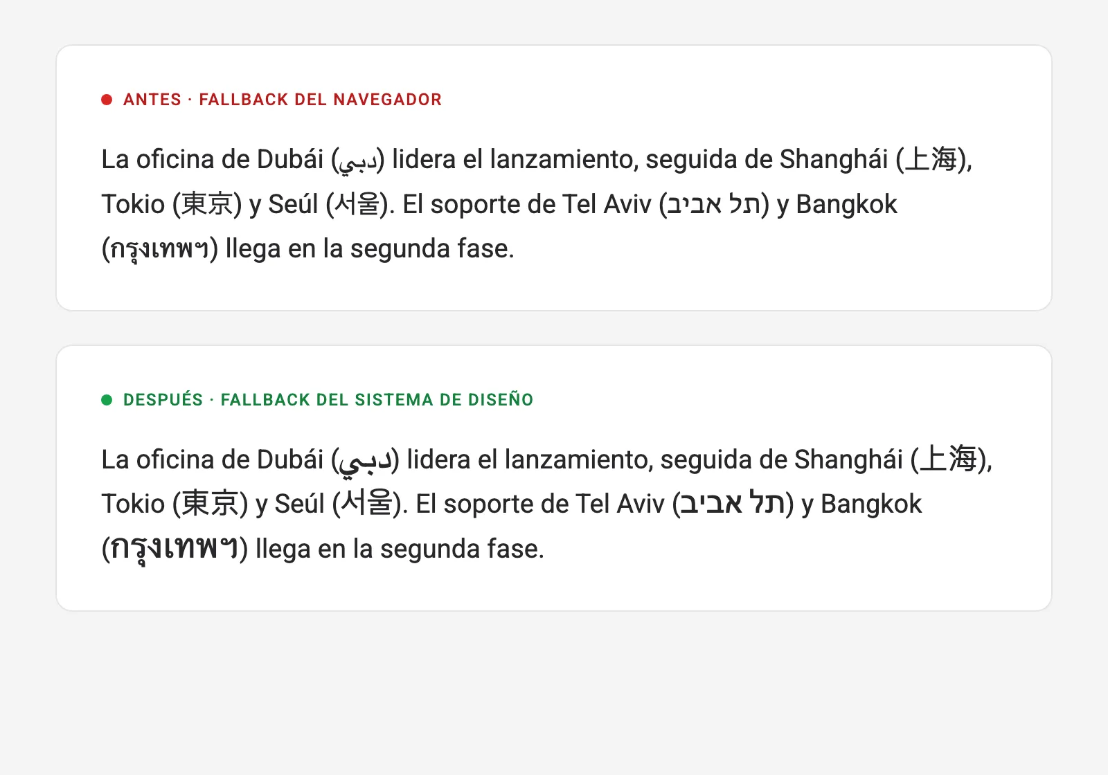
No :lang()-based solution helps here: language matching operates at element
level, and these glyphs share a text node with the Latin. The solution has to
operate where the problem operates, character by character.
What the usual routes cost
When an organisation runs into this, three options are usually on the table:
| Option | Direct cost | Hidden cost | Timeline |
|---|---|---|---|
| Commission or licence Arabic/CJK cuts of the brand font | Licences per script and per weight; often five figures | Contract management per market | Months |
| Load webfonts (Noto and similar) per language | Hosting/CDN | Megabytes per CJK script, worse LCP/CLS in exactly the new markets; subsetting pipeline | Weeks |
| Do nothing | £0 | Broken brand and relative illegibility in every non-Latin market | — |
The fourth option is the one this article documents: engineering on top of what every operating system already ships. macOS, Windows, iOS and Android include very good native grotesques for each writing system (PingFang, Geeza Pro, Yu Gothic, Nirmala UI, the Notos), drawn and maintained by the platforms themselves. There is nothing to buy and nothing to download. What is needed is knowing how to invoke them with typographic judgement. And that ships in the same release, with no new budget and no performance penalty.
The solution: three architecture decisions
1. A dedicated family, ahead of the brand font
I declare a single family, p4-typo-font-family-non-latin, made up of one
@font-face per script. Each face fences off its territory with unicode-range
and resolves against system fonts with local():
@font-face {
  font-family: 'p4-typo-font-family-non-latin';
  src: local('PingFang SC Regular'), local('PingFangSC-Regular'),
    local('Microsoft YaHei'), local('NotoSansSC-Regular'), local('Noto Sans SC');
  size-adjust: 110%;
  unicode-range: U+2E80-2EFF, U+3000-303F, U+3400-4DBF, U+4E00-9FFF, U+F900-FAFF, U+FF00-FFEF;
}

@font-face {
  font-family: 'p4-typo-font-family-non-latin';
  src: local('Geeza Pro Regular'), local('GeezaPro'),
    local('Segoe UI'), local('Tahoma'),
    local('NotoSansArabic-Regular'), local('Noto Sans Arabic');
  size-adjust: 140%;
  unicode-range: U+0600-06FF, U+0750-077F, U+08A0-08FF, U+FB50-FDFF, U+FE70-FEFF;
}
And I put it ahead of the Latin font in the family design tokens:
--p4-typo-font-family-base: 'p4-typo-font-family-non-latin', var(--p4-typo-font-family-roboto);
--p4-typo-font-family-alt:  'p4-typo-font-family-non-latin', var(--p4-typo-font-family-quicksand);
What makes this work is plain mechanics from the CSS fonts specification. Font
matching runs per character: for each glyph, the browser walks the stack and
only considers a face if its unicode-range contains that character. Since the
non-Latin family declares non-Latin ranges exclusively, Latin text passes through
it as if it were not there and lands on the brand font. An Arabic or Han
character, on the other hand, matches its dedicated face and wins because it
comes first. Glyph allocation is automatic, one by one, without a single line of
logic.
The operational consequence is the one that matters: the rest of the CSS never
finds out. Hundreds of components go on consuming the same token, with no
per-language branches, no :lang() selectors scattered about, no adoption cost
for the teams. The whole integration was two tokens.
2. local() instead of webfonts: the cost disappears
src uses local(), not url(): the browser resolves against fonts already
installed on the device. There is no download, no licence, no CDN, no FOUT and no
layout shift from late fonts. Each face lists a cascade of candidates per
operating system and the browser activates the first one that exists:
| Script | macOS · iOS | Windows | Android · web | size-adjust |
|---|---|---|---|---|
| Chinese | PingFang SC | Microsoft YaHei | Noto Sans SC | 110% |
| Japanese (kana) | Hiragino Sans | Yu Gothic | Noto Sans JP | 115% |
| Korean | Apple SD Gothic Neo | Malgun Gothic | Noto Sans KR | 115% |
| Arabic | Geeza Pro | Segoe UI · Tahoma | Noto Sans Arabic | 140% |
| Hebrew | Arial Hebrew | Segoe UI | Noto Sans Hebrew | 125% |
| Thai | Thonburi | Leelawadee UI | Noto Sans Thai | 130% |
| Devanagari | Kohinoor Devanagari | Nirmala UI | Noto Sans Devanagari | 130% |
| Bengali | Bangla Sangam MN | Nirmala UI | Noto Sans Bengali | 125% |
| Tamil | Tamil Sangam MN | Nirmala UI | Noto Sans Tamil | 125% |
All of them are neutral system grotesques, chosen to rhyme with a sans-serif
brand font. Nine unicode-range blocks cover everything from CJK to the Indic
scripts.
3. Optical calibration per script, not a magic number
size-adjust multiplies the face’s metrics, the scaling of the em, without
touching the computed font-size: components, rem units and spacing are left
intact. It is the same normalisation mechanism for fallbacks as
ascent-override or descent-override, applied to optical size.
The temptation is to set a single value for everything non-Latin. Typography disagrees: each writing system occupies a different proportion of the em square. Geeza Pro’s Arabic draws low, with timid ascenders, and needs 140% to stand at the height of the Latin. Han ideographs fill almost the whole em and sit level at 110%. A uniform value that rescued Arabic would leave Chinese out of proportion in the middle of a paragraph.
Every value in the table comes from a direct visual comparison against Latin, script by script, value by value:
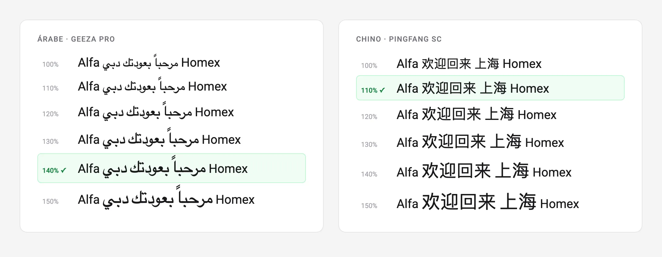
The CSS property is the same in both cases. What differs is that here each value
was decided by looking at the result and written down so that someone else can
repeat it. One implementation detail conditions the whole architecture:
size-adjust is a @font-face descriptor, not a property, and it only
exists inside a face whose src resolves. This per-script scaling is literally
impossible by stacking families in font-family.
The details that separate “works on my machine” from “works”
The names each browser uses to resolve local()
This is where the technique breaks silently, and hardly anyone documents why. An
installed font exposes several records in its OpenType name table: the family
name (PingFang SC), the full name (PingFang SC Regular) and the PostScript
name (PingFangSC-Regular, unique, no spaces, tied to a specific cut). The
specification allows local() to resolve by full name or PostScript name; what
each engine actually does I had to verify by testing it:
| Browser | local() resolves by… |
|---|---|
| Chrome · Edge | full name or PostScript only |
| Safari · Firefox | family name as well |
local('Geeza Pro') works in Safari and fails in Chrome, precisely the majority
browser. And the failure mode is poisonous: no resolution means no face, no face
means no size-adjust, and the whole system degrades to the default fallback
without a single console error. The only defence is listing all three forms of
the name in every src:
src: local('PingFang SC Regular'),  /* Chrome/Edge: full name */
     local('PingFangSC-Regular'),   /* Chrome/Edge: PostScript */
     local('PingFang SC'),          /* Safari/Firefox: family */
The browser walks the list in order and skips names that do not resolve: adding variants carries no risk, it only widens compatibility.
One face per script, not one face with everything
A single @font-face holding all the local() entries and all the ranges looks
more compact, but it hides a trap: a face activates one physical font, the first
candidate that resolves, for the entirety of its unicode-range. If PingFang
wins the race, Hangul and Arabic are orphaned and fall to an unscaled fallback.
Each script needs its own face, with its own font and its own range.
A weight-agnostic family
The faces declare no font-weight and anchor to the system’s Regular cut.
Non-Latin scripts do not offer the fine gradation of a Latin grotesque (asking
for font-weight: 100 over CJK produces synthetic smearing) and a single family
keeps everything in one file. The trade-off, stated openly: non-Latin bold is
synthetic over the Regular. If a market asked for it, 700 faces would be added
using the PostScript names of the Bold cuts. Until then, it is complexity that
does not pay for itself.
The known limit, in writing
No technique covers every case, and documenting the boundary is part of the
deliverable. Chrome on Android restricts local() over a good part of the system
fonts as an anti-fingerprinting measure. In CJK the Notos usually resolve because
they are families with an addressable name; Arabic is more fragile, because on
some devices it lives as an anonymous fallback family in fonts.xml, out of
reach of any alias. When that happens, the exits are
:lang(ar) { font-size: 1.4em }, which does not depend on local(), or a
surgical webfont for that script and that traffic segment alone, a decision that
can by then be taken with market data in hand. Having the limit written down
stops a team chasing a “bug” for days when it is in fact a platform restriction.
Taking it to another product
The technique rests on three standard CSS primitives (unicode-range,
size-adjust and local()) and does not depend on my brand or my stack: moving
it across takes changing the Latin font at the end of the token.
What it buys is easy to count. A launch in Arabic, Chinese or Thai does not wait for a licence or for a webfont pipeline to be built, because the typographic coverage is already in production. No new licences and no font hosting are paid for, and there are no CJK megabytes punishing LCP in the very markets being opened. Adoption was two tokens: no team touched a component or wrote per-language CSS. And the known limits are written down, which is the only way to stop anyone discovering them by losing an afternoon.
Arabic is the first script worth starting any test with: it is where the
calibration shows most, and the one that reveals soonest whether local() is
really resolving in Chrome.